
I just thought of this wacky simile. Photography is like a fire. Someone just put a bunch of fresh logs on - digital photography. In the ashes are glass plates, daguerreotypes, tin types (though I saw an awesome exhibit Joni Sternbach's Tin Types at the Peabody Essex Museum this summer). The embers underneath the fire, still glowing, is film.
I've been playing around with cameras and film this winter. Here are some images from a trip to Joshua Tree National Park.
Film is great for trying to be more creative. You have less control of the process in a way, because you can't see immediately how your images turned out. You can either plan your shots more carefully. Or just look, see, and press the shutter, and move on.
11 December 2009

04 December 2009
3D to 2D
One of the weirdest things about photography for me, is thinking of how a scene will look after the picture is taken. Ansel Adams was big into pre-visualization - imagining the final print before pressing the shutter button. What makes this difficult is that we see in three dimensions, but an image is only two dimensions. This means objects get flattened out, and with the right lenses and lighting, it produces an interesting visual effect, like this image below:

This image is of a building with a curvy front facade along Wilshire Ave, in Beverly Hills. But, by using a telephoto lens, and removing other elements that might give perspective (like trees, or telephone wires), the image becomes abstract. It reminds me of a barber shop pole.

This image is of a building with a curvy front facade along Wilshire Ave, in Beverly Hills. But, by using a telephoto lens, and removing other elements that might give perspective (like trees, or telephone wires), the image becomes abstract. It reminds me of a barber shop pole.
31 October 2009
28 October 2009
Why it's tough to print stuff?
I'm doing a few graphic design jobs right now that involve getting things printed. There's a lot that goes in to preparing artwork or files for printing, and since I just got business cards printed I thought I'd explain the process a bit.
Anyone who's printed images straight from their computer knows that the pictures don't look exactly like they do on screen. Part of the reason has to do with light. On a monitor, or television, the colors are additive. If the red, green, and blue colors combine in pixels, they create white. But, when you look at inks printed on paper, you're seeing subtractive color - all the inks would combine to black - think two-year-old playing with water colors.
One easy way to remember additive/subtractive:
A screen when it's off, starts out black. You have to add light to get color.
A paper with no ink, starts out white. You have to subtract light to get color. (subtract light by adding ink).
Another difference between screens and printed materials, is how they generate colors. Screen combine varying degrees of red, green, and blue (RGB). Printers most commonly use four colors in varying degrees to create colors, called a four color process. Printers use cyan, magenta, yellow and black (CMYK). As you might imagine, colors made with RGB have to be replaced with CMYK colors before being printed, which is not always identical.
There's a ton more about reproducing colors in print and on displays - color management is a field of expertise - but these are some basics to think about.
Anyway, here's a look at my business cards - I really like how the blue color came out.


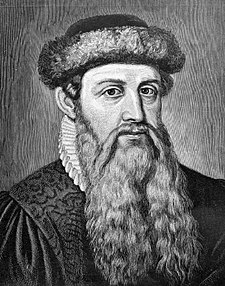
And here's a look at Gutenberg
Johannes Gensfleisch zur Laden zum Gutenberg - Printing Press 1440's
Anyone who's printed images straight from their computer knows that the pictures don't look exactly like they do on screen. Part of the reason has to do with light. On a monitor, or television, the colors are additive. If the red, green, and blue colors combine in pixels, they create white. But, when you look at inks printed on paper, you're seeing subtractive color - all the inks would combine to black - think two-year-old playing with water colors.
One easy way to remember additive/subtractive:
A screen when it's off, starts out black. You have to add light to get color.
A paper with no ink, starts out white. You have to subtract light to get color. (subtract light by adding ink).
Another difference between screens and printed materials, is how they generate colors. Screen combine varying degrees of red, green, and blue (RGB). Printers most commonly use four colors in varying degrees to create colors, called a four color process. Printers use cyan, magenta, yellow and black (CMYK). As you might imagine, colors made with RGB have to be replaced with CMYK colors before being printed, which is not always identical.
There's a ton more about reproducing colors in print and on displays - color management is a field of expertise - but these are some basics to think about.
Anyway, here's a look at my business cards - I really like how the blue color came out.


And here's a look at Gutenberg
Johannes Gensfleisch zur Laden zum Gutenberg - Printing Press 1440's
19 October 2009
Phone Pictures
There's been a ton of buzz about mobile phone pictures recently because of some cool applications available for phones these days. The two most recent (and useful) iPhone apps I've come across for taking and editing pictures are: TheBestCamera, and PS Mobile.
The Best Camera (is the one that's with you), is the brainchild of Chase Jarvis, who is always offering creativity tips and ways to make better images on his blog. I think he's a marketing genius - creating buzz for himself in a selfless way, by making and discussing ways to improve photography, creative projects, and collaboration. In the iPhone application, you can take a picture, or use and existing one, then easily apply or delete various filters - from warming/cooling or brighter/darker, to other more unique ones like "jewel," or "slate," which play with contrast, vingnette, and saturation. The coolest thing about the app is the ability to easily share photos to multiple outlets - twitter, facebook, email, and TheBestCamera gallery, which is constantly updating with a live feed from the application.


PS Mobile is from Adobe - a mini version of Photoshop, as well as a way to share images. Immediately, I wished I could send my photos to different outlets, instead of just the application's community page. Also, I didn't see a way to easily remove edits - for example, if you make a bunch of edits, you have to go back to the original image if you just want to remove the red tint you added. However, the finger motions to control the edits I found very intuitive, and I like the range of editing - instead of choosing "brighter," I can choose how much brighter I want to make the image by sliding my finger on the screen.
Here are some before/after images with PS Mobile:


So these apps are neat. What does that mean for pro photographers, designers, and creatives? Well, the best development is "accessibility." With a phone, you can take a picture, make a creative decision, then publish if for others to see and comment. This creates a community where hopefully, better ideas get shared faster. If I see someone's cool picture of X, maybe that gives me an idea of a picture of Y, which I show my friend who then creates Z, all from a little tool that most people always carry with them. A sort of creative "pay-it-forward" idea.
The Best Camera (is the one that's with you), is the brainchild of Chase Jarvis, who is always offering creativity tips and ways to make better images on his blog. I think he's a marketing genius - creating buzz for himself in a selfless way, by making and discussing ways to improve photography, creative projects, and collaboration. In the iPhone application, you can take a picture, or use and existing one, then easily apply or delete various filters - from warming/cooling or brighter/darker, to other more unique ones like "jewel," or "slate," which play with contrast, vingnette, and saturation. The coolest thing about the app is the ability to easily share photos to multiple outlets - twitter, facebook, email, and TheBestCamera gallery, which is constantly updating with a live feed from the application.
Here are some before/after images with TheBestCamera:


PS Mobile is from Adobe - a mini version of Photoshop, as well as a way to share images. Immediately, I wished I could send my photos to different outlets, instead of just the application's community page. Also, I didn't see a way to easily remove edits - for example, if you make a bunch of edits, you have to go back to the original image if you just want to remove the red tint you added. However, the finger motions to control the edits I found very intuitive, and I like the range of editing - instead of choosing "brighter," I can choose how much brighter I want to make the image by sliding my finger on the screen.
Here are some before/after images with PS Mobile:


So these apps are neat. What does that mean for pro photographers, designers, and creatives? Well, the best development is "accessibility." With a phone, you can take a picture, make a creative decision, then publish if for others to see and comment. This creates a community where hopefully, better ideas get shared faster. If I see someone's cool picture of X, maybe that gives me an idea of a picture of Y, which I show my friend who then creates Z, all from a little tool that most people always carry with them. A sort of creative "pay-it-forward" idea.
01 October 2009
Headed to Big Sky
Here's an image from somewhere in Indiana. It's actually three images merged for exposure using Photomatix (exposure blend, not HDR). Another cool thing that I believe is new in Photoshop CS4, is auto blend with images at different depth-of-fields. Translation = super in focus images at all distances to lens.


Leaving MN today, headed to Denver for the weekend.
28 September 2009
Camper Bike
After completing the first leg of my cross-country road-trip, as well as spending an afternoon people-watching in the Mall of America, it was nice to come across this eco-groovy travel alternative:

This camper bike is an idea from Kevin Cyr, a prototype and also the basis for some paintings. He's also working on a camping cart - a shopping cart with a pop up tent. There are some more pictures on his website, but no images of the interior. Definitely a far cry from my parents' awesome Airstream, nonetheless it looks like a fun way to get around, as long as you don't mind sweating a bit in the process.
25 September 2009
Digital Camera Capture

truck looks tilted because of how digital cameras make images - a sort
of scan from top to bottom (I don't think any capture horizontally).
This is from I-90, just outside of Chicago. About to go see the Cloud
Gate sculpture (the metal bean).
16 September 2009
9/11 Logos
I just found these logos on Brand New - A blog devoted to corporate brand identity. A few days late on this, but I can't decide which logo I like more. The before has such a unique viewpoint, yet is quiet and reserved. The newer one is much more accessible. I guess it will be the more public logo for the 9/11 Memorial Museum, which is supposed to open in 2011.
I love logos mostly for their simplicity in communication. It seems an impossible task for a designer to take all the weight of what the World Trade Center symbolizes, and translate it to a few words and simple graphics. When successful, logos I think are poignant - simple, but not easily forgotten.

I love logos mostly for their simplicity in communication. It seems an impossible task for a designer to take all the weight of what the World Trade Center symbolizes, and translate it to a few words and simple graphics. When successful, logos I think are poignant - simple, but not easily forgotten.
27 August 2009
Xray
This is an xray of my elbow. I broke it in 2000 playing lacrosse, but it's pretty much good as new. I just think it's a cool picture.


10 August 2009
Woodstock poster artist
Last Thursday I went to the International Poster Gallery, on Newbury Street in Boston. It's such a cool place for anyone into graphic design. It's filled with posters and vintage graphics from Art Deco, to Soviet, to Travel.
They invited the artist who designed the iconic Woodstock poster to talk a bit about it's creation. He also designed a 40th anniversary tribute poster that was for sale. One detail I found interesting: because the venue and band list wasn't set until close to the event, they organizers printed the poster without the black plate (text) first. They added it later once the information set.

They invited the artist who designed the iconic Woodstock poster to talk a bit about it's creation. He also designed a 40th anniversary tribute poster that was for sale. One detail I found interesting: because the venue and band list wasn't set until close to the event, they organizers printed the poster without the black plate (text) first. They added it later once the information set.

01 August 2009
Old Google
...And other past versions of sites. Although the website is hard to navigate, Archive.org catalogs all the incarnations of websites. The "WayBack Machine" lets you plug in a URL and returns results with dates of older versions. So much for the ephemeral state of the Internet!
1998 Google

1998 Google

31 July 2009
Mail Project
After moving twice since I acquired this "junk," I finally found time to take some photographs.
I worked at the New England Journal of Medicine, and sorted some mail while I was there - tons of crazy places of origins all over the world. The patterns of stamps and rips and ink I thought looked neat. The pieces of mail seemed to tell their journey through their roughed up packaging.
Let me know what you think.
I worked at the New England Journal of Medicine, and sorted some mail while I was there - tons of crazy places of origins all over the world. The patterns of stamps and rips and ink I thought looked neat. The pieces of mail seemed to tell their journey through their roughed up packaging.
Let me know what you think.
29 July 2009

24 July 2009
More Tilt Shift
The Canon 24mm TS-E is awesome. It's a bit different from using a view camera; takes a little getting used to the knobs and controlling the axes (took some brainpower to realize I needed to use the tripod head as a rear standard, not the lens).

Part of the the fun / trouble, is choosing between getting the lines vertical, or using the low depth of field (f/3.5) and miniaturizing things. For the image with the statue, I took the image "out-of-whack," then corrected the lines in photoshop to try and achieve both effects.

Another cool use is to merge photos. The image below of the door is actually three separate exposures - I simply shifted the lens, left, center, right. In photoshop, I chose File > Automate > Photomerge - then followed the dialog box. There's an article on this in the July/August Picture Magazine


Part of the the fun / trouble, is choosing between getting the lines vertical, or using the low depth of field (f/3.5) and miniaturizing things. For the image with the statue, I took the image "out-of-whack," then corrected the lines in photoshop to try and achieve both effects.

Another cool use is to merge photos. The image below of the door is actually three separate exposures - I simply shifted the lens, left, center, right. In photoshop, I chose File > Automate > Photomerge - then followed the dialog box. There's an article on this in the July/August Picture Magazine

20 July 2009
New Website
Finished my website update last Friday. Trying to keep it simple and clean is so tough. I used the Apple website, and a few other photographers websites as guides. Let me know any feedback about appearance or ergonomics - codygantz.com

15 July 2009
Tilt Shift


Just received some lenses from Borrowlenses.com - a 100mm Macro, and a 24mm TS-E II. I'm excited for both because they create much different looks than other lenses. Also, I want to try some video with each of them - slow-motion closeups of bugs or turtles or something with the macro, and try the miniaturizing effect with the tilt-shift in Boston.
Anyway here are some images I just took with the tilt-shift. It's also great for correcting lines in architecture, so more to come from this. AJ, you would love this lens.
11 July 2009
Issuu - Publishing Site
I mentioned this site in my post on publishing and creativity. Just testing it out for myself now, by uploading a brochure - student work from Hallmark.
The site operates like a bookshelf. You can search or browse the library of uploaded content (that users make public), and can then bookmark the content - anything from presentations, to catalogs, to newsletters. This adds it to your 'shelf,' where you can organize things into folders (like most email programs), or share, or download.
The makers of Issuu pretty much hold your hand through the whole process with little videos, which is nice. Plus, the website interface is simple and easy to use anyway. One of the coolest things, though, is that you can implement their slick document presentation on your own site. Haven't come across any sites using this feature yet, but I'm testing it out offline.
08 July 2009

04 July 2009
Publishing
Just finished watching Chase Jarvis' talk : Consequences of Creativity. He spoke to ADCD (Art Director's Club of Denver) and ASMP, a photographer's organization.

One point that stuck me, and anyone who reads anything these days, is that creative people can now also be the ones who publish / share their work. It doesn't have to be "validated" by an ad agency or magazine editor, you create stuff and throw it on the web and instantly people can watch your latest cat-themed-youtube video.
The cool thing about this, is that there's and abundance of stuff to find, created by people with no other motive than just to create. For instance my friend Eric Millard - a great musician - just put up some of his songs on facebook and myspace. The 'goal': simply to meet people with similar interests. With social network and publishing sources like TubeMogul and Issuu, the 'why' of publishing is more of a 'why not' - it's so easy.
I started thinking of all this while I was searching my bookmarks and came Motionographer, and this strange video by Terry Timely: Synesthesia. For some reason, it seems less outlandish after returning from Beijing last night. (And yes, there are cats).

Macro video to Radiohead song
I found this video on my friend Sydney's blog - she's a west coast artist.
I love the slow-motion combined with macro scenes. And insects make for great subjects with the lyrics.
10 June 2009
Polaroid resurrection attempts
This is a link to a New York Times photo gallery - a collection of polaroids sent to the paper in response to a story about resurrecting a polaroid factory.
There are ton of cool adaptations with the film, mixing funky lighting and development, with illustrative things as well.
For sure the film was cool, but I'm scanning old 35mm film right now, and it's awful. Digital polaroids, anyone? I guess that's why there's Photoshop
02 June 2009
iPhone photos

This photo uses 'polarize' and 'toy camera.' Photo is from Shelburne
Falls- not looking forward to the hills on the bikeride back
31 May 2009
The Crane Estate

but the interior sounds awesome - mix of gothic, art deco, and other
styles.
Afterwards, questing for more fried clams.
29 May 2009
Type is Art
Here is a stop action film I made - took a bunch of still photographs, where I moved the graphic elements just a tiny bit each frame. Got the inspiration from two places: Sue Tallon - my favorite food and conceptual photographer right now; and TypeIsArt, a website where you can mash around parts of letter into graphic art pieces. The song I created last fall, and it's just been kicking around my head with no outlet. I think it fits with this video.
28 May 2009
25 May 2009

24 May 2009
Hip to the Internet
Sorry about the last few posts - I'm trying to figure out all these
connections between mobile gizmos, social networks and blogs. And yes
even twitter
connections between mobile gizmos, social networks and blogs. And yes
even twitter
23 May 2009

12 May 2009
New York Aerial
Found these this virtual flight over NYC from a recent post from Chase Jarvis, an awesome photographer in Seattle.
29 April 2009
Still some use for turntables!
I have my parents' turntable in the corner of my apartment, but I'd never thought of doing something like this. Maybe I just like the wolf costumes...
28 April 2009
Tuckermans
Here's a video of one of the two avalanches we saw last weekend at Tuckermans Ravine on Mt. Washington. I photographed the remnants later on, and got some cool ski photos as well. Thanks Geoff and Tucker for getting me to come up to the mountain for some awesome weather and skiing. I'll will post some of my photos soon.
23 April 2009
Athlete Portraits
Thanks Josh and Lukasz for modeling. Luke graduated and rowed with me, and Josh is a senior at BU this year. Let me know what you think.


21 April 2009
Swiss Chard?
Do you ever find yourself with a lot of swiss chard left over from a photography shoot? You might like this recipe I tried recently:
Heat up oil and balsamic in skillet.
Dump in some chard and top with some ground and crushed red pepper.
Let it cook for a bit (doesn't get as limp as spinach), then top with some feta cheese.

First Race of the season
BU won last weekend up in Hanover against Dartmouth. Here's an image from the end of their first race agaisnt Northeastern. They lost by a length or so.

20 April 2009
Metallic Spray paint
I spray painted a couple things with this cool metallic paint. I'll probably try some other things as well soon. Trying to find a way to spice up my "reflective metal" assignment.


16 April 2009


14 April 2009


Subscribe to:
Posts (Atom)

