Angeleno Magazine - a high-end fashion/food/entertainment publication in LA - used some of my event photos in their January issue! I photographed their 10th Anniversary party in December, and it's pretty cool to see my images in print.
You can see the issue online at the Modern Luxury Media, I believe it's page 59.
26 January 2010
13 January 2010
Bokeh Video
Just playing around with holiday decorations and street lights, making super out-of-focus balls of light. I like how the colors overlap. Plus, who doesn't like a little Otis.
11 December 2009
The fire of photography
I just thought of this wacky simile. Photography is like a fire. Someone just put a bunch of fresh logs on - digital photography. In the ashes are glass plates, daguerreotypes, tin types (though I saw an awesome exhibit Joni Sternbach's Tin Types at the Peabody Essex Museum this summer). The embers underneath the fire, still glowing, is film.
I've been playing around with cameras and film this winter. Here are some images from a trip to Joshua Tree National Park.
Film is great for trying to be more creative. You have less control of the process in a way, because you can't see immediately how your images turned out. You can either plan your shots more carefully. Or just look, see, and press the shutter, and move on.
I've been playing around with cameras and film this winter. Here are some images from a trip to Joshua Tree National Park.
Film is great for trying to be more creative. You have less control of the process in a way, because you can't see immediately how your images turned out. You can either plan your shots more carefully. Or just look, see, and press the shutter, and move on.
Labels:
creativity,
digital,
film
04 December 2009
3D to 2D
One of the weirdest things about photography for me, is thinking of how a scene will look after the picture is taken. Ansel Adams was big into pre-visualization - imagining the final print before pressing the shutter button. What makes this difficult is that we see in three dimensions, but an image is only two dimensions. This means objects get flattened out, and with the right lenses and lighting, it produces an interesting visual effect, like this image below:
This image is of a building with a curvy front facade along Wilshire Ave, in Beverly Hills. But, by using a telephoto lens, and removing other elements that might give perspective (like trees, or telephone wires), the image becomes abstract. It reminds me of a barber shop pole.
Labels:
2d,
3d,
architecture,
flattening,
image,
perspective,
pre-visualization
31 October 2009
28 October 2009
Why it's tough to print stuff?
I'm doing a few graphic design jobs right now that involve getting things printed. There's a lot that goes in to preparing artwork or files for printing, and since I just got business cards printed I thought I'd explain the process a bit.
Anyone who's printed images straight from their computer knows that the pictures don't look exactly like they do on screen. Part of the reason has to do with light. On a monitor, or television, the colors are additive. If the red, green, and blue colors combine in pixels, they create white. But, when you look at inks printed on paper, you're seeing subtractive color - all the inks would combine to black - think two-year-old playing with water colors.
One easy way to remember additive/subtractive:
A screen when it's off, starts out black. You have to add light to get color.
A paper with no ink, starts out white. You have to subtract light to get color. (subtract light by adding ink).
Another difference between screens and printed materials, is how they generate colors. Screen combine varying degrees of red, green, and blue (RGB). Printers most commonly use four colors in varying degrees to create colors, called a four color process. Printers use cyan, magenta, yellow and black (CMYK). As you might imagine, colors made with RGB have to be replaced with CMYK colors before being printed, which is not always identical.
There's a ton more about reproducing colors in print and on displays - color management is a field of expertise - but these are some basics to think about.
Anyway, here's a look at my business cards - I really like how the blue color came out.
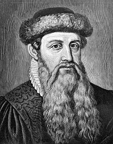
And here's a look at Gutenberg
Johannes Gensfleisch zur Laden zum Gutenberg - Printing Press 1440's
Anyone who's printed images straight from their computer knows that the pictures don't look exactly like they do on screen. Part of the reason has to do with light. On a monitor, or television, the colors are additive. If the red, green, and blue colors combine in pixels, they create white. But, when you look at inks printed on paper, you're seeing subtractive color - all the inks would combine to black - think two-year-old playing with water colors.
One easy way to remember additive/subtractive:
A screen when it's off, starts out black. You have to add light to get color.
A paper with no ink, starts out white. You have to subtract light to get color. (subtract light by adding ink).
Another difference between screens and printed materials, is how they generate colors. Screen combine varying degrees of red, green, and blue (RGB). Printers most commonly use four colors in varying degrees to create colors, called a four color process. Printers use cyan, magenta, yellow and black (CMYK). As you might imagine, colors made with RGB have to be replaced with CMYK colors before being printed, which is not always identical.
There's a ton more about reproducing colors in print and on displays - color management is a field of expertise - but these are some basics to think about.
Anyway, here's a look at my business cards - I really like how the blue color came out.
And here's a look at Gutenberg
Johannes Gensfleisch zur Laden zum Gutenberg - Printing Press 1440's
19 October 2009
Phone Pictures
There's been a ton of buzz about mobile phone pictures recently because of some cool applications available for phones these days. The two most recent (and useful) iPhone apps I've come across for taking and editing pictures are: TheBestCamera, and PS Mobile.
The Best Camera (is the one that's with you), is the brainchild of Chase Jarvis, who is always offering creativity tips and ways to make better images on his blog. I think he's a marketing genius - creating buzz for himself in a selfless way, by making and discussing ways to improve photography, creative projects, and collaboration. In the iPhone application, you can take a picture, or use and existing one, then easily apply or delete various filters - from warming/cooling or brighter/darker, to other more unique ones like "jewel," or "slate," which play with contrast, vingnette, and saturation. The coolest thing about the app is the ability to easily share photos to multiple outlets - twitter, facebook, email, and TheBestCamera gallery, which is constantly updating with a live feed from the application.
PS Mobile is from Adobe - a mini version of Photoshop, as well as a way to share images. Immediately, I wished I could send my photos to different outlets, instead of just the application's community page. Also, I didn't see a way to easily remove edits - for example, if you make a bunch of edits, you have to go back to the original image if you just want to remove the red tint you added. However, the finger motions to control the edits I found very intuitive, and I like the range of editing - instead of choosing "brighter," I can choose how much brighter I want to make the image by sliding my finger on the screen.
Here are some before/after images with PS Mobile:

So these apps are neat. What does that mean for pro photographers, designers, and creatives? Well, the best development is "accessibility." With a phone, you can take a picture, make a creative decision, then publish if for others to see and comment. This creates a community where hopefully, better ideas get shared faster. If I see someone's cool picture of X, maybe that gives me an idea of a picture of Y, which I show my friend who then creates Z, all from a little tool that most people always carry with them. A sort of creative "pay-it-forward" idea.
The Best Camera (is the one that's with you), is the brainchild of Chase Jarvis, who is always offering creativity tips and ways to make better images on his blog. I think he's a marketing genius - creating buzz for himself in a selfless way, by making and discussing ways to improve photography, creative projects, and collaboration. In the iPhone application, you can take a picture, or use and existing one, then easily apply or delete various filters - from warming/cooling or brighter/darker, to other more unique ones like "jewel," or "slate," which play with contrast, vingnette, and saturation. The coolest thing about the app is the ability to easily share photos to multiple outlets - twitter, facebook, email, and TheBestCamera gallery, which is constantly updating with a live feed from the application.
Here are some before/after images with TheBestCamera:
PS Mobile is from Adobe - a mini version of Photoshop, as well as a way to share images. Immediately, I wished I could send my photos to different outlets, instead of just the application's community page. Also, I didn't see a way to easily remove edits - for example, if you make a bunch of edits, you have to go back to the original image if you just want to remove the red tint you added. However, the finger motions to control the edits I found very intuitive, and I like the range of editing - instead of choosing "brighter," I can choose how much brighter I want to make the image by sliding my finger on the screen.
Here are some before/after images with PS Mobile:

So these apps are neat. What does that mean for pro photographers, designers, and creatives? Well, the best development is "accessibility." With a phone, you can take a picture, make a creative decision, then publish if for others to see and comment. This creates a community where hopefully, better ideas get shared faster. If I see someone's cool picture of X, maybe that gives me an idea of a picture of Y, which I show my friend who then creates Z, all from a little tool that most people always carry with them. A sort of creative "pay-it-forward" idea.
Labels:
Adobe,
applications,
creative,
creativity,
facebook,
iphone,
phone,
photography,
photoshop,
PS Mobile,
sharing,
social networking,
The Best Camera,
twitter
Subscribe to:
Posts (Atom)